Hello and welcome to my blog. It’s Sunday night again and that means another CASEing the Catty Blog Hop. You may be starting with me this week or you’ve arrived here from Lauren’s gorgeous creation. Make sure you visit all the Design Team’s Blogs by clicking on the “next” button at the bottom of each post.
This week we are CASEing from the Love, Thanks and Support section of the Annual Catalogue, pages 72-97.
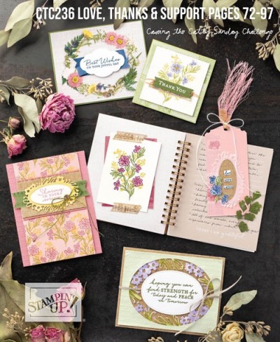
I’ve chosen the card on the right hand side of page 87. I’m not sure why this card stood out to me because if I’m brutally honest, I don’t really like it, it’s just a tad too busy for me. Sorry, am I allowed to say that?
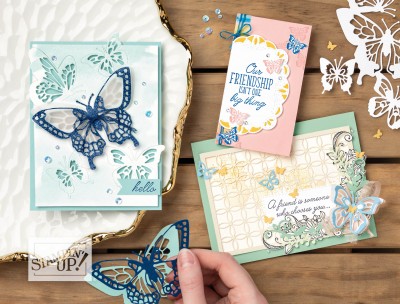
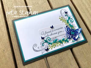
So I thought I would create a more simplified version using the same stamp set but different colours.
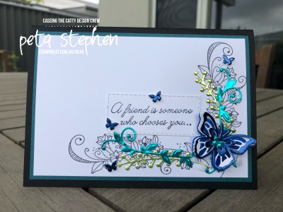
My card base is Basic Black with a layer of Pretty Peacock. I’ve stamped the image from Beauty Abounds in Black Memento Ink, directly onto some Whisper White card stock. I’ve used all 3 colours from the Noble Peacock Foil Sheets (they are so pretty) and die cut the leaves and butterfly using the Butterfly Beauty Thinlits Dies.
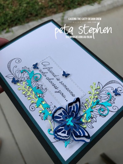
There’s 3 layers to my butterfly, vellum coloured with a Stampin’ Write Marker, Whisper White and Blueberry Bushel Foil Sheet. The sentiment has been die cut with a Rectangle Stitched Framelit.
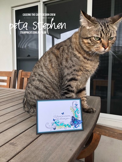
My assistant Marvi was on hand for a quick photo. He’s been a bit naughty lately, especially during my classes. He likes to sit where everyone is trying to work and he supervises all the die cutting.
Next up tonight is Rebecca’s beautiful project. Just click on the “Next” button to hop right over.
We’d love for you to join this challenge. Click below and send us a request to join then just upload your new creation to the wall.
Thanks for stopping by.


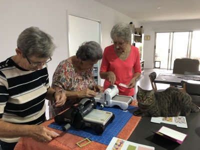
I love your less fussy card! I can’t wait to use that foil as it looks so pretty. One of my kitties has finally decided to come out and visit the ladies after 6 years of classes at home. I have to stop him eating the plastic bags that their orders are put in!!
I love the way you’ve taken a card that appealed to you and stripped it down and turned it into yours. This is such a beautiful colour combination – especially the metallics with the black and white. A lovely spin on the original, Peta. Marvi should look more impressed!!!
I am in total agreement with you, and I think your card is much nicer! The metallics looks amazing, and the cleaner background lets them really shine.
The foil elements really elevate what was a fairly simple card
I love that you were inspired by a card you didn’t like! And to be honest, I think I love your version more
And what did you put on the envelope…lol?
Stunning de cutting with the foil sheets. ❤️❤️❤️❤️ Totally love your white space too. It’s shows off this layout to perfection.
The foils are beautiful, I’m going to have to order some I think. I like your design better too, it seems better balanced.
Beautiful card, Peta and I love the clean lines and white space on your version. The foil elements really add heaps of pop. Marvi doesn’t have his happy face on today, lol.
Love your simplified version. The colour change up is perfect too – much more to my taste! Kelly x